The convergence of the philosophical and the practical is found in all good architecture, where the two become inseparable. One without the other will not serve the range of physical and psychological forces that will ultimately determine a real sustainable future for a building.
 The University of Minnesota Washington Avenue Pedestrian Bridges create a sense of arrival that is memorable for students and visitors alike, connecting Cass Gilbert’s Northrop Mall with Coffman Plaza and serving both a symbolic and practical role as gateway and aesthetic link to the Mall. Designed to replace two 1940s-era spans, the new bridges are clad in stainless steel with brick and stone bases, and curve away from the primary axial view of the Mall, in deference to its historic character while still looking to the future.
Architecture that serves a community, county, city or region does not begin with a single idea or expression. The process must not leap forward without consensus of the community, the client and the design team because, in the end, all of our beliefs about an institution, a place, a country, are built on a democracy of shared responsibility and commitment.
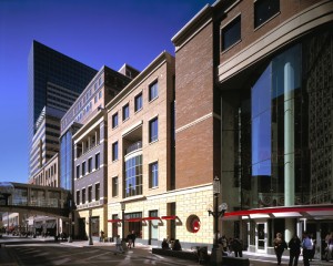 Nicollet Mall is the backbone of downtown Minneapolis. In the design of the 900 Nicollet mixed-use project, the design team recognized the community’s strong attachment to the buildings that once stood on the site by incorporating salvaged architectural terracotta cornices and medallions from existing buildings razed to meet the city’s growth towards higher density in the central core. Drawing upon a broad range of feedback from community and city government meetings, resulted in a process and a project that is both diverse in expression and a fit into its context.
The energy of a good city is difficult to emulate. The vibrant mix of culture, community and density create an environment that generates excitement, fosters creativity and encourages interaction.
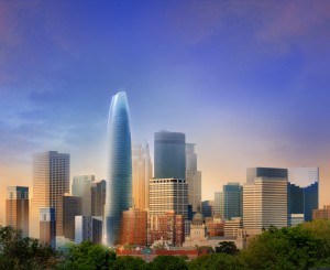 The Minneapolis 360 Tower Proposal (pictured) aims to establish a new urban district, enriching the city of Minneapolis. The 1,500,000-square-foot building is envisioned as a landmark project on the skyline while positively enhancing the pedestrian experience. Proposed to occupy what is now a surface parking lot, the project’s design intensifies the street by creating a gateway on Hennepin Avenue, anchored by a diverse mixed-use program. The broader vision of the project included workforce housing and green space on the adjacent block, supporting the development of a live/work district within the city.
Each of us has a different way in which we perceive space. How we use it with others becomes a factor in how we might shape it, how we might furnish the space, the distances between various elements, the acoustics, natural and artificial light and thermal conditions. Special attention must be paid to the differences that each social group will have in the way they experience a building.
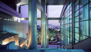 In traditional Korean culture it is important not to block views and connections. By splitting the Yonsei University Medical Center Severance Hospital’s two primary components with a monumental four-story stair (pictured) punctuated with gardens, city and mountain views and water features, we preserved the connection and created a sense of journey through the site.
In the design of the University Hospital in Dubai, spaces are large and transition seamlessly from the exterior to the interior, giving patients and visitors a clear sense of place within the context of Dubai Healthcare City. Healing gardens and fountains, providing coolness in a hot climate, surround the building. A double-walled exterior skin utilizes two layers of glass: one to create a comfortable interior environment and the second to act as a screen, filtering sunlight with a frit pattern inspired by traditional Islamic architecture. This high-tech exterior wall system is in contrast to a more historical design approach at the podium, which draws inspiration from the traditional stone forms of wind towers and mosques of the region.
Over the past 100 years, the natural world has taken a back seat to development. We have built cities and communities that turn their backs on prevailing winds, solar orientation, building heights, density and open space, with too many paved streets, too many places that feel inhuman. We are beginning to turn the corner on recognizing how much we have given up in designing without nature.
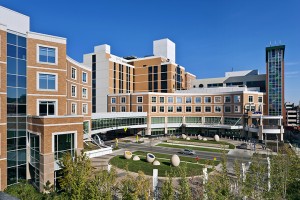 Children’s Hospitals and Clinics of Minnesota (pictured) developed a vision to merge architecture, landscape, science and art in a way that will ultimately transform the healthcare experience of the people who come to their Minneapolis campus, and foster urban renewal along Chicago Avenue. The new construction provides a sense of welcome that is uncommon to large urban hospitals. The architecture is pedestrian focused, with familiar materials and qualities that connect the campus to its urban context. Art, in both the public realm and within the hospital, emerged as a primary strategy to link the new building with the community and adjacent neighborhoods while promoting healing. Providing connections to nature through access to daylight in interior spaces and through gardens likewise became an important part of the design solution. Linking the urban street landscape along Chicago Avenue with the natural landscape of the healing gardens merges architectural form with art and nature, and invites the community to participate in the life of the institution.
In healthcare, in particular, contact with nature through access to daylight in patient and staff spaces, natural ventilation and therapeutic gardens that supplement the healing process, are again becoming an integral part of the design solution. We recognize that integration of natural systems improves our overall patient and family experience across all aspects of hospital design, both inside and outside.
 Connecting nature and architecture was the primary conceptual direction for the Samsung Cancer Center in Seoul, South Korea (pictured). Atrium spaces nestle into the surrounding forest preserve. Existing vegetative areas removed during the construction were replaced as a green roof, controlling stormwater run-off while providing healing gardens for patients and staff. Use of traditional materials, such as stone walls, emphasize Korean gardens and provide a sense of permanence that is expected in major public buildings. Similar to the stone walls, clear, untinted glass is used as an important design element in all primary public areas to emphasize the relationship between interior healing spaces and exterior healing spaces. This creates the necessary transparency to give patients and visitors a sense of well being and a cultural sense of place within the building and its context. The atrium is the most important element of the building in this regard. Special attention was given to the structure, rhythm and canting of the glass wall. The wall is structural glass, while the skylit roof is held up by cantilevered steel trusses. This creates a column-free space along the west wall of the atrium, maximizing transparency to the forested hill and garden. The system not only creates a significant interior image, but also a unique image for the entire building.
Beauty in architecture has an impact on how a community feels about itself. This aspect of sustainability causes people within the community to value the buildings it has, and will, over the years, repair and maintain them. The building that people love (for whatever reason) is the building that people respect and learn from. System functionality and beauty can be aspects of learning and sustaining the longevity of architecture.
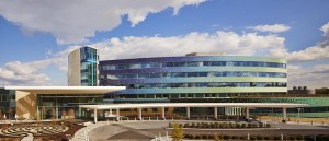 The design of the Mercy Health – West Hospital gives the new hospital a unique presence in its community. Inspired by Ohio’s tradition of art pottery production, the West Hospital features a unique mosaic exterior wall system – comprising 11 different colors and 19 different shapes of glazed brick tiles. The blue-to-green color palette of the building skin was inspired by ceramics glazes, as well as the landform and color of the valleys and hills of the region. Within the context of a diverse landscape, the building uses a similar palette of reflective glazes, assembled in a custom gradient color application. When taken in the context of the sky and landscape, the architecture will continually provide a new experience to building users, changing with the quality of light, the time of the day, and the seasons.
Credits:
Washington Avenue Pedestrian Bridges: Ellerbe Becket with Mic Johnson, lead designer
900 Nicollet: Ellerbe Becket with Mic Johnson, lead designer
Minneapolis 360 Tower Proposal: Ellerbe Becket with Mic Johnson, lead designer
Yonsei University Medical Center Severance Hospital : Ellerbe Becket with Mic Johnson, lead designer
Samsung Cancer Center: Ellerbe Becket with Mic Johnson, lead designer
University Hospital: Ellerbe Becket with Mic Johnson, lead designer
Children’s Hospitals and Clinics of Minnesota, Minneapolis Campus: Ellerbe Becket with Mic Johnson, lead designer
Mercy Health – West Hospital: Ellerbe Becket/AECOM with Mic Johnson, lead designer